
Overview
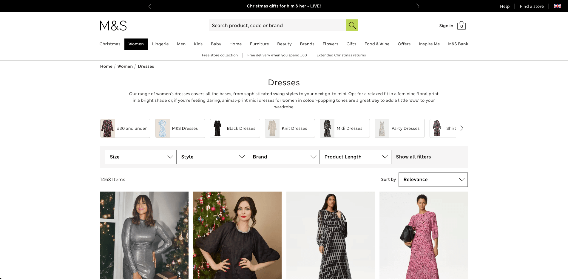
Marks & Spencer is one of the UK's largest and most recognised retailers, with millions of monthly visitors across clothing, home, and food. I joined as a senior frontend engineer working on the Product Landing Page (PLP) and Search Landing Page (SLP) — the two highest-traffic page types on the site and the primary drivers of browse-to-purchase conversion.
The pages I worked on serve hundreds of product categories, from women's jeans to furniture, each with their own filtering requirements, sort logic, and editorial layouts. Getting these right at M&S scale means engineering for correctness, performance, and accessibility simultaneously.
The Challenge
The existing filter and search experience had accumulated technical debt across several years of incremental changes. On mobile — where the majority of M&S traffic arrives — the filter flow was a significant friction point in the purchase journey. Users were dropping off before narrowing to relevant results, which directly suppressed conversion.
Separately, the team had committed to a Progressive Web App initiative in collaboration with Google, requiring parts of the site to meet strict PWA performance and offline criteria without breaking the existing experience.
What I Worked On
Filter Rebuild
The filter system on M&S's PLP is complex — a faceted search panel with multiple filter types (fit, size, colour, brand, rise, and more), live item counts, and state that needs to synchronise with the URL for shareability and back-navigation.
The rebuild focused on two things:
Mobile UX — the filter needed to move from an overlay pattern that obscured context to a flow that let users understand how their selections were narrowing results in real time. Item counts per facet update as filters are applied, giving users confidence before committing to a selection.
Desktop sidebar — a persistent left-rail filter panel with independent scroll, keeping the product grid visible while filters are adjusted.
Both implementations shared the same underlying state model, with the display layer adapting to breakpoint. The result was a measurable improvement in filter engagement and downstream conversion, particularly on mobile.
PWA Integration
Working in collaboration with Google, I led frontend work on transforming sections of the M&S site into a Progressive Web App. This involved:
- Service worker implementation for offline caching of shell assets and key static resources
- Web App Manifest configuration for add-to-homescreen support
- Performance auditing and Lighthouse score improvements to meet PWA criteria
- Ensuring the PWA layer didn't degrade the existing SSR-rendered experience for non-PWA users
The PWA work required close coordination with infrastructure and the backend team to align on cache headers, CDN configuration, and the boundary between server-rendered and client-hydrated content.
Furniture Section
I was part of a small team dedicated to revamping the furniture category — a section with distinct UX needs compared to clothing (larger images, dimension filters, room context photography). This involved adapting the shared PLP component architecture to support category-specific layouts without forking the core codebase.
Engineering Approach
Test-Driven Development — The team operated in a TDD environment using Jest. I was responsible for building and maintaining the test suite for the filter and search components, writing tests before implementation to drive interface design. This approach paid off significantly when the filter was refactored for the mobile redesign — the existing test suite caught regressions early and gave the team confidence to move quickly.
Design collaboration — Working closely with the design team, I acted as a bridge between design intent and technical feasibility. For complex filter interactions, I'd prototype in code early to surface constraints before they became expensive to resolve in production.
Component architecture — The PLP is a shared foundation for hundreds of category pages. Any change needs to be tested across a wide matrix of category configurations, filter types, and editorial overrides. This meant building components with clear, stable interfaces and avoiding category-specific logic leaking into shared code.
Context
M&S.com is a high-stakes frontend environment — the site handles millions of sessions daily, is deeply SEO-critical, and serves a broad demographic including a significant proportion of older users who place high demands on accessibility and clarity. Frontend decisions at this scale carry meaningful commercial weight, which shaped every technical choice I made on the project.